Tuesday 16th December 2014 at
11:07 am
At ViewPro, we’re constantly looking to find the best way to visualise data. By showing people key information in an easy to dissect manner, we believe that they can learn from what they’ve done historically and improve their methods into the future.
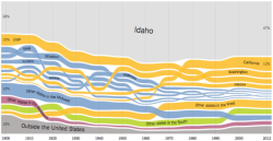
We spotted an article on Gizmodo Australia that captured our attention. Some people have really excelled in portraying data in new and novel ways.
Here’s hoping ViewPro makes it onto the list one day!
Article: The Best Data Visualizations Of 2014. [Hat tip: Nathan Yau]